

Please use Chrome or Safari to be mystified by the animation.Firefox doesn't work.
Once again a very happy day to all of you.This will be my second tutorial on HTML under the tech label.
With CSS becoming very popular due its innovative eye candies, javascripts are slightly fading away.
Alright in this tutorial i will be elaborating on how to make your links appear as attractive buttons with a glow effect, this way you can popularize your site or blog.
Actually the credits for creating this piece of usefulness goes to Zurb who call it radioactive buttons, but honestly whatever codes they had given, never actually worked, I just could not figure it out.You will lose your head, if you are amateur CSS dummy like me.
So after many painstaking hit and trail attempts, I managed to succeed and here is what you have to do.
Since I have performed this on the blogger platform, i will explain it on its basis, but its pretty similar for other platforms too.
First....
1.First thing you need to do is go to CSS section of your webpage which is before the </head> tag and paste the following code.
.green.button {
background-color: #91BD09;
}
@-webkit-keyframes greenPulse {
from { background-color: #749a02; -webkit-box-shadow:: 0 0 9px #333; }
50% { background-color: #91bd09; -webkit-box-shadow:: 0 0 18px #91bd09; }
to { background-color: #749a02; -webkit-box-shadow:: 0 0 9px #333; }
}
a.green.button {
-webkit-animation-name: greenPulse;
-webkit-animation-duration: 2s;
-webkit-animation-iteration-count: infinite;
}
.red.button {
background-color: #E33100;
}
@-webkit-keyframes redPulse {
from { background-color: #bc330d; -webkit-box-shadow: 0 0 9px #333; }
50% { background-color: #e33100; -webkit-box-shadow: 0 0 18px #e33100; }
to { background-color: #bc330d; -webkit-box-shadow: 0 0 9px #333; }
}
a.red.button {
-webkit-animation-name: redPulse;
-webkit-animation-duration: 2s;
-webkit-animation-iteration-count: infinite;
}
.blue.button {
background-color: #2DAEBF;
}
@-webkit-keyframes bluePulse {
from { background-color: #007d9a; -webkit-box-shadow: 0 0 9px #333; }
50% { background-color: #2daebf; -webkit-box-shadow: 0 0 18px #2daebf; }
to { background-color: #007d9a; -webkit-box-shadow: 0 0 9px #333; }
}
a.blue.button {-webkit-animation-name: bluePulse;-webkit-animation-duration: 2s;-webkit-animation-iteration-count: infinite;}
.orange.button {
background-color: #FF5C00;
}
@-webkit-keyframes orangePulse {
from { background-color: #d45500; -webkit-box-shadow: 0 0 9px #333; }
50% { background-color: #ff5c00; -webkit-box-shadow: 0 0 18px #ff5c00; }
to { background-color: #d45500; -webkit-box-shadow: 0 0 9px #333; }
}
a.orange.button {
-webkit-animation-name: orangePulse;-webkit-animation-duration: 3s;-webkit-animation-iteration-count: infinite;}
.magenta.button {
background-color: #A9014B;
}
@-webkit-keyframes magentaPulse {
from { background-color: #630030; -webkit-box-shadow: 0 0 9px #333; }
50% { background-color: #a9014b; -webkit-box-shadow: 0 0 18px #a9014b; }
to { background-color: #630030; -webkit-box-shadow: 0 0 9px #333; }
}
a.magenta.button {-webkit-animation-name: magentaPulse;-webkit-animation-duration: 3s;-webkit-animation-iteration-count: infinite;}
By doing this we are assigning the animation and color
We can also vary the duration of animation by
changing the numeral in
changing the numeral in
-webkit-animation-duration :
2. Next for giving shape to your buttons paste the following code
below the above one.
below the above one.
.button {3. Finally save it.
background: #222
display: inline-block;
padding: 5px 15px 6px;
color: white !important;
font-size: 13px;
font-weight: bold;
line-height: 1;
text-decoration: none;
-moz-border-radius: 50px;
-webkit-border-radius: 50px;
-moz-box-shadow: 0 1px 3px rgba(0, 0, 0, 0.25);
-webkit-box-shadow: 0 1px 3px rgba(0, 0, 0, 0.25);
text-shadow: 0 -1px 1px rgba(0, 0, 0, 0.25);
border-bottom: 1px solid rgba(0, 0, 0, 0.25);
position: relative;
cursor: pointer;
overflow: visible;
width: auto;
}
.large.button {
font-size: 14px;
padding: 8px 19px 9px;
}
And whenever you would like to use this exhilarating CSS effect add
class = "large green button" as an attribute of the anchor tag <a> .
to change colors use "large blue button" or "large magenta button" or "large orange button"
Like below.
<a class="large blue button" href="www.decryptlife.blogspot.com">Blog 4 Fun is awesome</a>
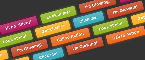
This will give a button like this
Similarly for a red button
<a class="large red button" href="www.decryptlife.blogspot.com">Blog 4 Fun is awesome </a>
This attribute will give you a button like this
So I hope you have understood this tutorial given to you by a dummy.
Hope it helps you in enhancing your websites's looks.
Fiddle around with it and you ought to understand it.
For more colors you have to add another 3 paragraphs of CSS with a different hexadecimal color code.
If you have any questions or abuses at all please don't hesitate to use the comment box.
So Like, Comment, Share or Subscribe.


